There is a particular kind of silence that falls over a room when you've just finished painting it and you know — deep in your gut, before you've even put the roller down — that you've made a mistake.
I've heard that silence three times.
In the same room.
Round One: The Navy That Ate All the Light
Let me back up. When Derek and I bought this house in Nashville, the living room was beige. Not a warm, creamy beige that makes you feel held. The sad beige. The beige of a landlord who had one gallon left in the garage and a security deposit to protect.
I had a vision. I was going to do something bold. I'd spent eight years as a residential designer telling clients not to be afraid of color, and I was going to take my own advice. So I picked a deep navy — the kind of moody, dramatic shade that looks incredible in design magazines photographed by someone with a lighting budget.
It took one full weekend and two gallons of paint. By Sunday evening, I was sitting on the floor staring at walls that had swallowed every ounce of natural light our south-facing windows offered. The room didn't feel dramatic and cozy. It felt like the inside of a jewelry box someone closed and forgot about.
Derek walked in, trumpet case in hand, and said, "It's... dark."
He was right. Navy had made our modest living room feel half its size. Also — and I say this as someone who spent years specifying fabrics for a living — navy paint absorbs light differently than navy upholstery. I knew this. In theory. But theory doesn't cover your walls.
Round Two: The Greige That Gave Up by Afternoon
For attempt number two, I swung the other direction. If bold had failed me, I would go with the safest thing I knew: greige. That gray-beige hybrid that designers have been pushing for a decade as the answer to everything. I picked a warm greige from a reputable paint brand — good light reflectance value, subtle undertones, the works.
We painted the room again. Same weekend commitment. Same two gallons. Same Derek taping off the baseboards with the quiet patience of a man who married a designer and knew what he was signing up for.
And for a few weeks, I thought I'd fixed it. The greige looked fine. Not beautiful, not interesting, but fine. Until I noticed something: every single afternoon, when the sun shifted around 3 p.m., those greige walls turned faintly lavender.

Not lavender in a charming, intentional way. Lavender in a "why does my living room look like a baby shower from 2011" way.
I had forgotten to test the paint on all four walls at different times of day. Or rather, I had tested it — on one wall, at 10 a.m., with a single swatch the size of a Post-it note. That swatch had looked perfect. The entire room, three weeks in, looked like an undertone science experiment gone wrong.
What I Actually Did Between Rounds Two and Three
I stopped painting and started testing. Properly.
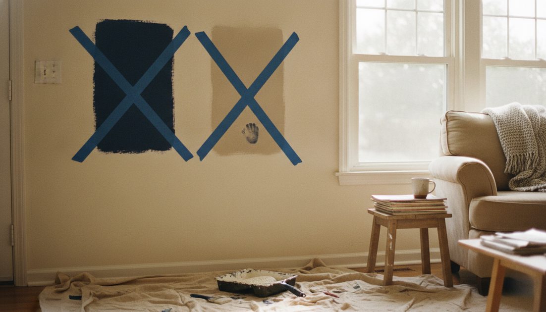
I bought sample pots of five different warm whites and neutral-toned paints. I painted large swatches — at least two feet square — on the north wall, the south wall, and the wall next to the window. I lived with them for two weeks. I looked at them at 7 a.m. with coffee, at noon with a sandwich, at 5 p.m. with a four-year-old asking what was for dinner, and at 9 p.m. with just the lamp on.
Mia, age four, contributed by pressing her thumb into one of the swatches while it was still wet. I left it there. It felt honest.
Here's what I learned during those two weeks: the right living room paint color isn't the one that looks best on a sample card. It's the one that looks good when the room is messy, when it's cloudy, when you're exhausted, and when the only light source is the glow of a TV someone left on.
Round Three: The Color That Stayed
The color we landed on — the one I'm writing this next to right now — is a warm, off-white with the faintest clay undertone. It's from Benjamin Moore's off-white collection. It's not flashy. It's not bold. It's not going to get pinned ten thousand times.
But here's what it does: it makes the room feel larger, it shifts beautifully with the changing light, and it lets everything else in the room breathe. The thrifted chair in the corner looks like a deliberate choice instead of something that got lost in the dark. The budget room makeover I'd been trying to pull off finally stopped fighting itself.
Total cost for all three paint jobs: just under $340, including the sample pots I should have bought the first time. I'm including that number because every designer blog I've ever read glosses over the cost of mistakes. Mistakes are part of the project budget. They just are.
What I Wish I'd Known (And Technically Did Know)
I have a color theory certification. I spent years helping clients choose the right neutrals for their spaces. And I still got it wrong twice — in my own home, with my own walls, on my own timeline.
The difference between working on a client's house and working on your own is that a client's house doesn't have your 3 p.m. exhaustion in it. It doesn't have your kid's half-finished snack on the coffee table or your husband's trumpet case wedged next to the sofa. When you're choosing paint colors for your own home, you're not just choosing a color. You're choosing what you want to feel every single time you walk into the room.
I wanted to feel calm, not cave-dark. I wanted warmth, not lavender regret. I wanted a room that looked good in real life — not just in the ten minutes after a photo shoot.
And for anyone standing in the paint aisle right now, holding three nearly identical white chips and starting to panic: buy the sample pots. Paint the big swatches. Wait two weeks. It's cheaper than painting the room twice.
A home is never finished. But this room — finally, mercifully — is painted.
No feedback yet — submit the first.